CGTN
CHANNEL BRANDING
CHANNEL BRANDING

We have worked with CGTN since 2013 on the on-air branding of the five foreign language channels and developed several global image campaigns.
CGTN – China Global Television Network (formerly CCTV News) is an international, multi-language media organization launched by CCTV and incorporated in China Media Group. It is headquartered in Beijing, China.
CGTN – China Global Television Network (formerly CCTV News) is an international, multi-language media organization launched by CCTV and incorporated in China Media Group. It is headquartered in Beijing, China.


The news identity
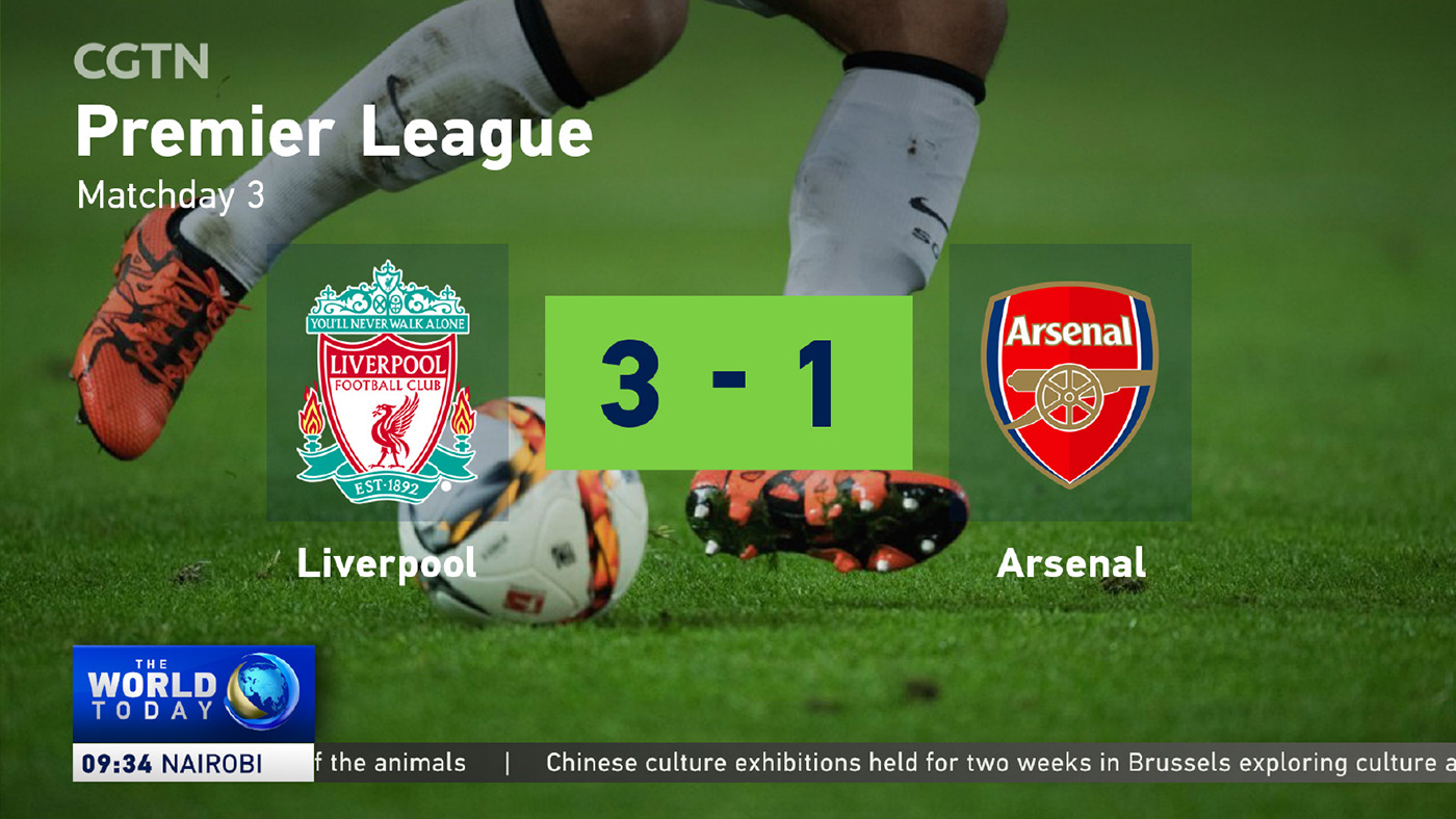
The 2019 update on the established CGTN design sees bigger typography and adds new features, such as a left third area for more editorial possibilities. CGTN retains its distinctive look and color combination of blue and gold.


Show logo bugs
The show names are still located in the show logo bug. Along with the rebranding of the programs, we also designed a number of new logos.

Maps and infographics
To increase the cross-platform consistency the whole on-screen design became a comprehensive facelift. It includes bolder text charts, flattened shapes and a set of new graphical charts. The template based design works across all the 5 languages. Over 300 single elements had to be adapted in favor of the new look.

Credits
Client: CGTN, China Global Television • Agency: Flint Skallen / Stefan Mueller • Created and produced by Perfect Accident • Creative Director: Martin Kett • Creative Team 2019: Martin Pedrini, Constanze Müller, Andrea Bednarz, Iris Pfennig
Client: CGTN, China Global Television • Agency: Flint Skallen / Stefan Mueller • Created and produced by Perfect Accident • Creative Director: Martin Kett • Creative Team 2019: Martin Pedrini, Constanze Müller, Andrea Bednarz, Iris Pfennig


